Today, I helped Justin to help his friend (Jen Han?) to plot an Excel diagram with big and small data. If we use default settings, small data will just lie on the x-axis. To solve this, we need to add a secondary axis. We can do it as follows.
From a chart with default settings, try selecting a small data series. If we cannot select it, just select any thing in the chart and keep pressing arrow keys up or down to circulate highlight until we reach the small data series. Then, right click and choose 'Format Data Series...'. Next, look for an axis option and plot the small series on a secondary axis.
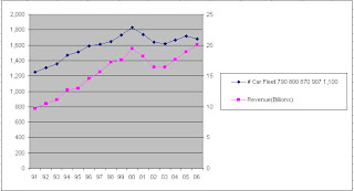
We will get a result like what I show below
 Figure 1. An Excel plot with two y-axes (the right one is referred to as a secondary axis in Excel)
Credit: thank you ProjectWoman whom I got the information from

